Consumer tasks needed one coherent self-service experience
All work
myGP: Telecom Service Ecosystem
Built from scratch for 70M+ users across consumer, agent, business, partner, subscription, and rewards experiences.
- Project
- myGP: Grameenphone
- Client
- Telenor Group | Asia | Bangladesh
- Industry
- Telecom
- Product Type
- B2C | Consumer
- Platform
- Mobile App | Android & iOS
- My Role
- UX Lead
The challenge
70 million users. One ecosystem to invent.
The challenge was not to refresh an existing interface. It was to create a connected digital platform from scratch for consumers, service agents, business users, and partners. The ecosystem had to feel simple even as its capabilities grew.
Agents needed service and performance workflows shaped around their role
Businesses needed trustworthy onboarding and verification
OTT and partner services needed consistent discovery and purchase
Offers, loyalty, and gamification had to feel useful without becoming distracting
Scale & context
A platform this broad only feels simple when every role follows the same system.
70M+
Subscriber scale
Many roles
Consumer · Agent · Business
500+
Bilingual product flows
Consumer self service
Agent operations
Business verification
Services & OTT
Rewards & loyalty
Discovery research
The product was competing with a person.
Before designing the platform, the discovery work examined the reality behind a top-up: an established agent network could explain, recommend, confirm, and resolve issues in person. Self-service had to earn that trust in every step.
01
The app itself
Core journeys were walked on a throttled connection - the real operating condition, not office Wi-Fi.
02
Years of store reviews
Reviews were coded across access, transaction, findability, performance, and support.
03
Regulator records
BTRC rulings, complaint volumes, hearings, and national subscriber data supplied the public context.
04
Competitor teardown
Rival operator apps, wallets, and the agent channel revealed the alternatives users already understood.
Evidence to design brief
Four friction points made self-service feel harder than the agent.
- Access
You cannot buy data without data
When data ran out, opening the app to buy more depended on the very connection a customer no longer had.
- Choice
Choosing a pack became the customer’s job
The agent used to narrow the decision. A growing package list returned that cognitive load to the customer.
- Trust
You cannot tell whether payment worked
Reviews showed people paying twice or waiting for confirmation because the result did not feel reliably final.
- Reach
When something breaks, there is nowhere to go
The complaint route existed, but research showed it was not discoverable enough when a customer needed it.
The research changed the brief.
The goal was not to add more features than other apps. It was to make the fastest path feel dependable: preserve the agent's clarity, remove the connection dependency, make offers comparable, and show an unambiguous outcome after every important action.
Desk researchResearch sources (25)
Public reporting, regulatory records, company disclosures, product listings, and competitor references informed the desk research. External links open in a new tab.
- Prothom Alo · Internet users decrease
- SAMENA Daily News · BTRC data
- The Business Standard · Mobile internet subscribers
- Grameenphone · Investor relations
- New Age · BTRC internet-pack order
- RTV · BTRC flexible-package guidelines
- DM News · Flexible data packages
- The Daily Star · Call drops and patchy internet
- Dhaka Tribune · BTRC public hearing
- The Daily Star · Data affordability
- GSMA · Mobile Gender Gap Report
- The Daily Star · Flexiload retail network
- Prothom Alo · Recharge irregularities
- myGP · Google Play
- myGP · Apple App Store
- Grameenphone · myGP product page
- Portonics · Project profiles
- MyBL · Apple App Store
- MyBL · Google Play
- Softonic · My Banglalink review
- My Robi · Google Play
- My Robi Lite · Google Play
- bKash · Mobile recharge
- Future Startup · Mobile financial services
- The Business Standard · Mobile money transactions
Design framework
Four principles. Every flow followed them.
Consumer self-service, agent operations, business verification, partner services, OTT subscriptions, offers, loyalty, and gamification served different needs. Every experience followed the same decision framework, making 500+ bilingual flows feel like one product.
See it fast
Lead with the information needed now.
Choose clearly
Reduce options to the decision that matters.
Act in fewer steps
Keep the primary task direct and predictable.
Recover with confidence
Make status, feedback, and next steps explicit.
Design decision
Information architecture for every role
Challenge
Consumers, agents, business users, and partners entered the platform with different goals, permissions, and definitions of success.
Design move
Created entry points and task hierarchies for each role while preserving one shared navigation language, component model, and interaction grammar across the ecosystem.
Design decision
Agent & business operations
Challenge
Service agents and business users needed to serve customers, verify organisations, track progress, and understand performance without disconnected operational tools.
Design move
Designed guided service flows, business verification, clear status states, and agent leaderboards around the next decision.
Design decision
Service marketplace & subscriptions
Challenge
Telecom packs, OTT subscriptions, partner services, and offers carried different terms, durations, eligibility rules, and renewal behaviours.
Design move
Standardised discovery, comparison, eligibility, confirmation, and renewal patterns through one familiar purchase model.
Design decision
Loyalty, offers & gamification
Challenge
Rewards, bonus data, offers, and leaderboard mechanics needed to motivate continued engagement without obscuring primary telecom tasks.
Design move
Separated utility from motivation: core actions remained accessible while progress, rewards, and personalised offers appeared contextually.
Multilingual design system
One product. Two languages. No duplicated design system.
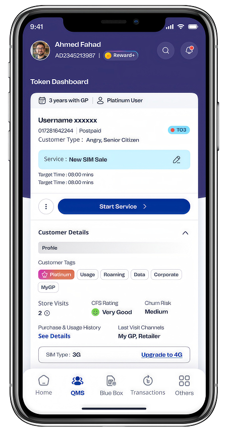
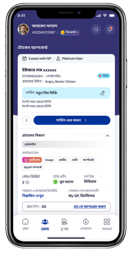
Bengali was essential to the myGP experience, but the design team could not independently read the language. More than 500 flows and interactions had to be created in both languages from the start.
Language became a system property.
Figma tokens and variables separated interface intent from displayed language, letting one governed design switch between English and Bengali without recreating the product.
Semantic content tokensFigma language modesShared componentsBilingual review
- 70M+users
- A copy or layout defect could become a nationwide experience problem.
- 500+flows + interactions
- English and Bengali states were created together.
- 2languages
- English and বাংলা governed through the same architecture.
- 1system
- One source for meaning, content, spacing, and states.
Interaction fidelity
Every interaction, prototyped before it was built.
Every tap, transition, validation, loading state, and recovery path was recreated in Figma. Engineering could experience the intended interaction language instead of inferring it from disconnected frames.
Design system at scale
Consistency at product scale.
The library governed interface, behaviour, and language together. Designers, engineers, and reviewers shared one source of truth for a product serving Bangladesh at national scale.
800+
Components
Reusable variants and states
500+
Product flows
Mapped from entry to recovery
2
Languages
English and Bengali modes
1
Governed system
Shared design and build logic
What the system governed
Foundations
Typography, colour, spacing, accessibility tokens, and responsive rules.
Components
Reusable variants with documented states, behaviour, and content constraints.
Patterns
Repeatable task logic for navigation, feedback, validation, and recovery.
Language modes
English and Bengali content switched through variables instead of duplicated files.
Home experience
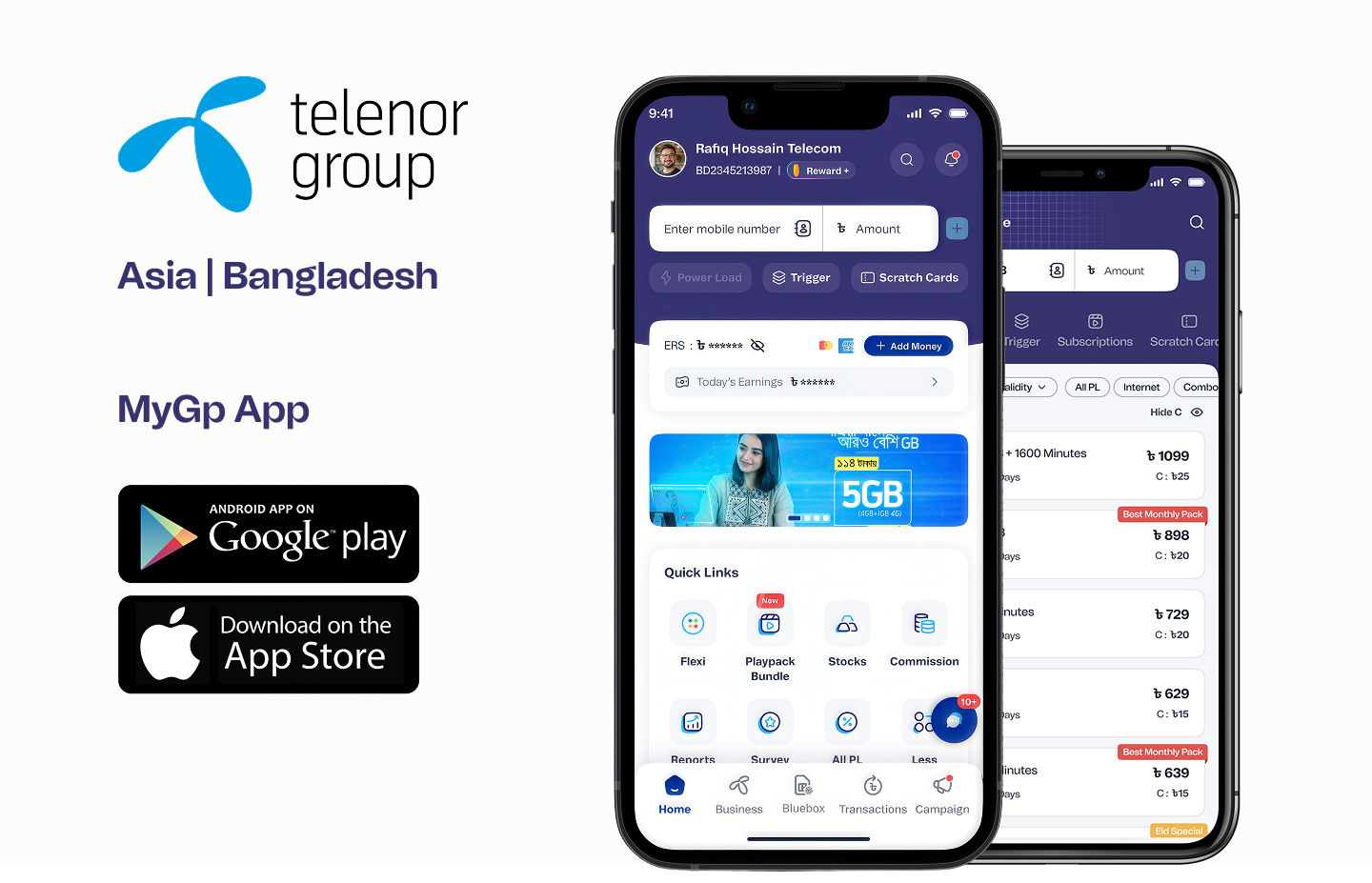
The home screen, built for Bangladesh.
Created from scratch as a digital home for 70M+ users across Bangladesh. The walkthrough shows how each decision works in motion.
Balance anchored above the fold
Available balance, remaining data, and expiry date appear first.
Six essential tasks in one tap
Recharge, Data, Minutes, Combo, Bill, and More need zero navigation depth.
Smart offer recommendation
Today's Best Recharge Offers brings the most relevant plan forward.
Progressive service disclosure
Other Services groups entertainment, bills, and GP Store by usage frequency.
Persistent bottom navigation
Home, Recharge, Pay, and More cover 95%+ of user intent from any screen.
Contextual content feed
Offers, affiliations, and GP Star loyalty appear as users scroll.
Impact & outcomes
Measured outcomes. Recognised impact.
The platform improved critical consumer tasks and created one shared experience for agents, businesses, partners, subscriptions, rewards, and service operations. It also contributed to an ecosystem recognised for technology excellence at national scale.
70M+
Subscriber scale
35%
Faster recharge
25%
Less friction
40%
Better visibility
2025
Digital telecommunications award
Measurement basis: Subscriber scale and award recognition are publicly published. Improvement figures are drawn from internal product analytics provided by myGP and Grameenphone.
2025 award
Recognised for digital telecommunications excellence.
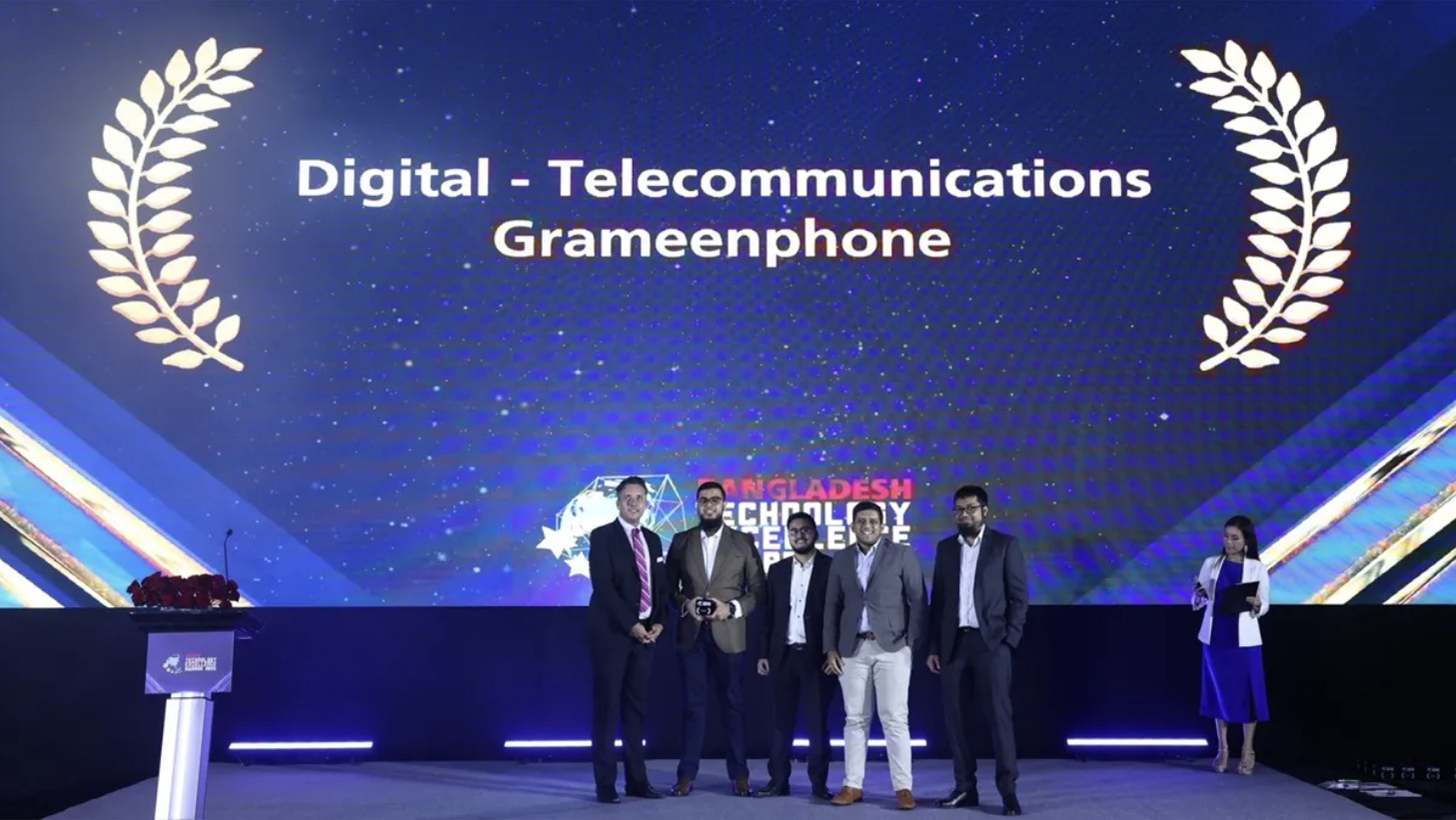
Grameenphone received the Bangladesh Technology Excellence Award in the Digital Telecommunications category. The award citation highlighted myGP's evolution into a leading everyday digital platform.
Read the award coverage23M+
Monthly users
4M+
Streaming & subscriptions
3×
Search conversion
Continue exploring
Explore other projects.
Browse more product design work across complex systems, emerging technology, and high-impact experiences.
Let’s Talk
Let’s createimpact together.
I’m a Product Design Manager and Consultant open to complex products, strategic challenges, and high-impact collaborations. Whether you have a project, idea, or just want to say hello — I’d love to connect.
Built on real problems, not just pixels.
Priority DM
Connect directly to discuss UX, AI, product strategy, and what's next.
DM NowEmail Me
Shoot me an email. I read every one, yes even the memes.
Connect Socially
Follow or connect. Let’s turn conversations into collaboration.